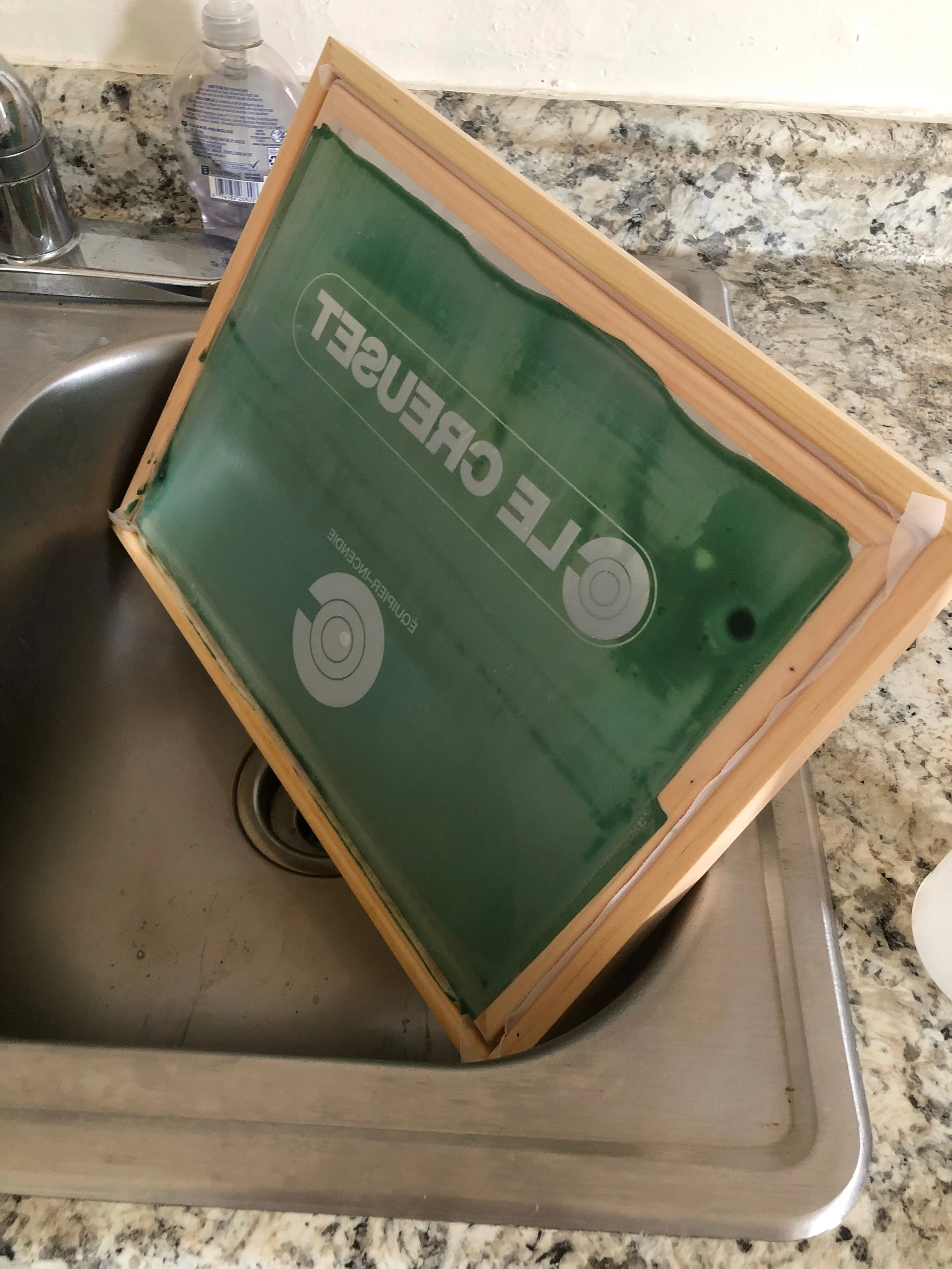
My first commissioned screen print imagined what the Le Creuset craftsmen and women could wear while firing cookwear in their ovens in France.
Requested by my good friend Duncan as a holiday gift for his girlfriend Frankie, these bootlegs were to simulate apparel for a very specific job. Frankie has always been an incredible cook, and was really into sourcing vintage Le Creuset cookwear at the time. Duncan and I, having more of a merch/apparel focus to our interests, thought the best gift would meld the two worlds.
Le Creuset already has a wonderful, timeless logo, so I wanted to create a type system that was unobtrusive and pragmatic. I went with a bold Helvetica that would stand out against the logo in all caps. I felt Helvetica lent really well to the French “Équipier Incendie” (fire equipment). It also closely emulates the brand’s logo font, Suisse Int’l.
It was rewarding trying to match paint colors to the exact branded orange of Le Creuset– such a large part of the brand’s iconicity. I felt as though I got pretty close.
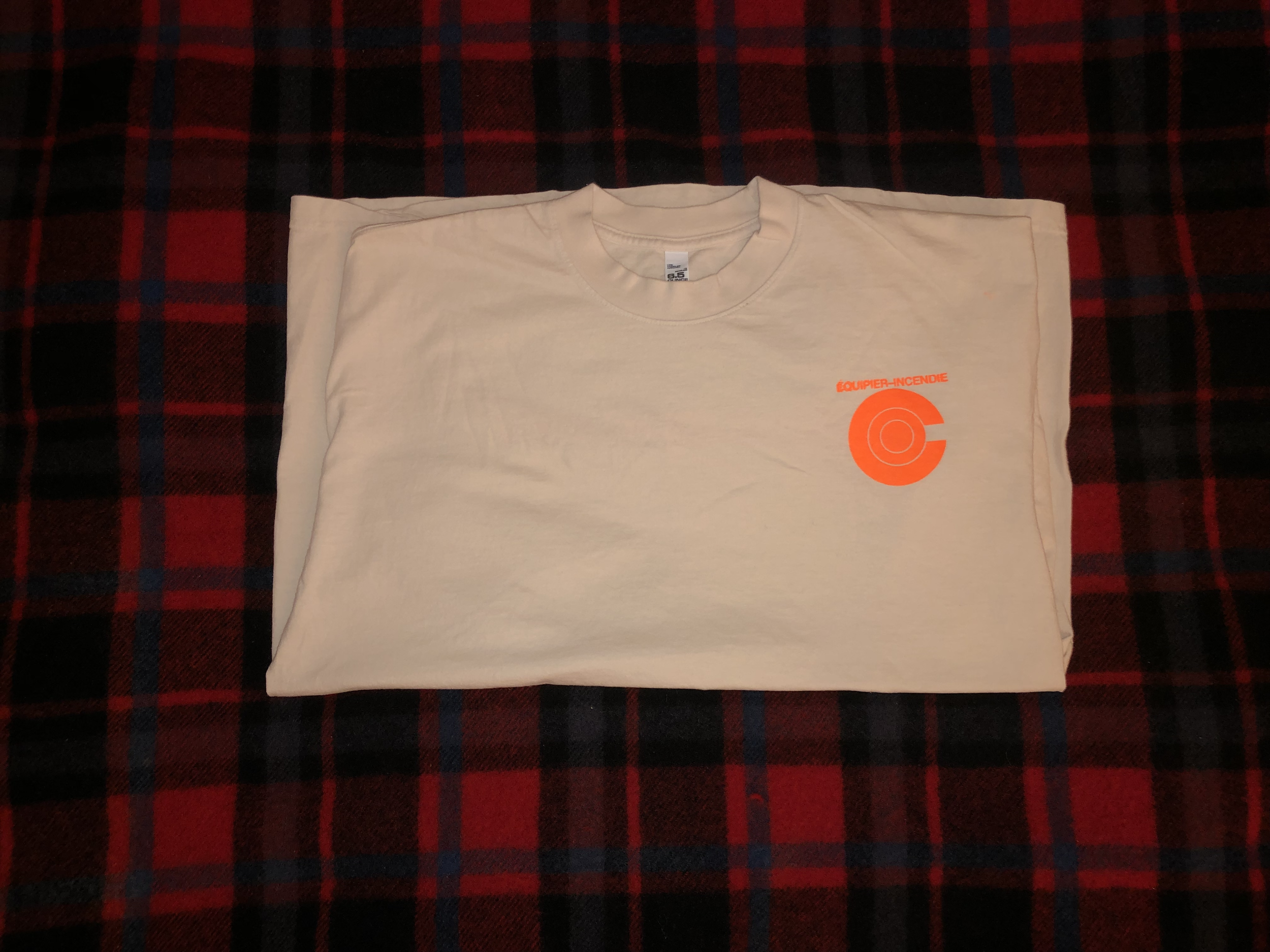
I’ve always thought graphics–specifically on t-shirts– look best on the front left chest and again on the back. For the front, I created the fire equipment logo with the circular “C”. On the back, I used Le Creuset’s wider logo system.
Shirts were printed with white and orange paint on white and black American Apparel blanks.
December 2023.